UX/UI case study
The app that helps students to cope with loneliness and build social connections based on their personality and interests

The problem
College students, who started a new chapter in their lives and often move away from their homes, need a way to find new friends to cope with their loneliness and learn how to build deeper connections with their classmates.
Solution
Create a social app that allows students to connect with their classmates when they feel lonely in a safe manner. It’s not possible through texting so CIRKLE app helps students interact with each other through actual meetups or online discussions. They can join these events based on their interests. The project was created based on the Design thinking process.

Design thinking process
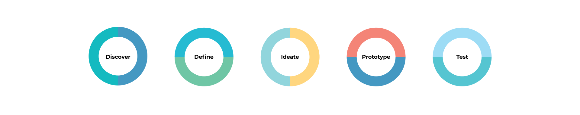
Discover
The research helped to gather information about the students affected by loneliness, the definition of chronic loneliness, and the consequences of this issue. User interviews and market analysis helped to define design drivers and borrow some features from existing apps.
Research
“Loneliness is a huge issue on campuses across the country. In fact, in a survey conducted by the American College Health Association of nearly 48,000 college students found that a whopping 67% of females and 54% of males had felt “very lonely” in the past 12 months. ”
“New research from The University of Texas at Austin suggests people too often opt to send email or text messages when a phone call is more likely to produce the feelings of connectedness they crave.”
“WebMD on how to feel more connected to those around you, and battle loneliness that will be used in designing this app:
• Be kind to others
• Get Outside
• Move your body
• Stay Busy/ Plan ahead
• Use social media wisely
• Rediscover a hobby”
“Psychology Today suggests to connect in real life. Connecting in real life may not be as easy as it once was. We often default to using our smartphones—it’s easier, and now it’s culturally accepted. But we can decrease our loneliness if we build stronger in-person connections. We do this by looking people in the eyes, listening, being mindful, and choosing not be distracted by our phones or other technologies. ”
Define
Design drivers
What?
User friendly
Make happier
Safe & secure
Works for introverts & extraverts
Encourage interaction
Give options to go out & explore
How
Simple, fun, and easy to use, including non-native English speakers
Bright neutral colors
Registration with school email
Audio conversations for introverts & actual meetups for extraverts
No texting, just joining the online discussion or actual meetup
Schedule of different events based on interests
Personas
User interviews showed how it's difficult to build deeper connections with classmates. User interviews defined the necessity of two user groups - extraverts and introverts which were used for personas. Further development of the app concentrated on two options for users - meeting in person and online conversations.

Ideate
User interviews and market analysis helped to define design drivers and borrow some feeds from existing apps. Initial wireframes were changed a lot after user testing. Mid-fidelity mockups were tested to prove the branding colors.
Brainstorming

How to overcome loneliness?
Social club
Activity that changes every week/month
Regular bases
Surprise factor
Hobby/game night
Doing something together
Nothing that will say - loneliness - stigma
No attachment - found friends? you can stop coming
Need more friends? - continue coming
Project club
Working together on a long-term project
There is a GOAL
A way to know new people
Division by
Contest feeling
More commitment
Stay busy - activity
Exchange of skills activity
Game night
Cooking together - really big kitchen
Activity that connects lonely feeling students
App that connects students from other places
Regular meetings
Get to know classmates better
New hobby
Volunteer
Find friends through interests
Find her community
Realize that it’s just temporary
Time for self-impovement
Make small plans with friends
Learn psychology tricks
Another app
User flow of the app
The user flow of this app is such that each user follows a specific path depending on their tasks. This app targets two types of users, both of which build their event list based on their personality, and is allowed to switch offered paths at any time.
User flow of the app

Registration taskflow

Joining a certain event taskflow

Information architecture
Information architecture chart organized information in a clear and logical way to help users navigate through the app.

Wireframing & mockups
Low-fi wireframes
Mid-fidelity mockups

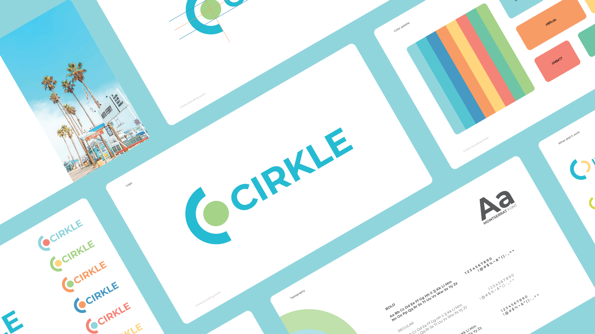
Style guide
This app's color palette was inspired by the summer - season when all students are happy but also by color psychology. We chose bright and bold colors at the beginning, but after user testing, the color palette was changed to muted one. According to color studies, blue is the most common favorite color among the world’s population. It’s the color of calm and serenity. Green is considered to be calming and restful.
We chose Montserrat font, optimized for digital usage, which is best used in minimal user interfaces. The name “CIRKLE” was taken from the phrase “circle of friends” and a circle became a main element of the logo and UI.

Prototype
CIRKLE is a social media application that allows students to connect with their classmates through meetings and online conversations. The goal of this project is to connect students when they feel lonely in a safe manner. The safety is secured by school email which is required for registration.
This app is different from other social media apps. It is supposed to build deeper connections between classmates that may lead to friendship. Users can use CIRKLE when they feel lonely and interact with other students (meetups and discussions) in a more productive way than just messaging.
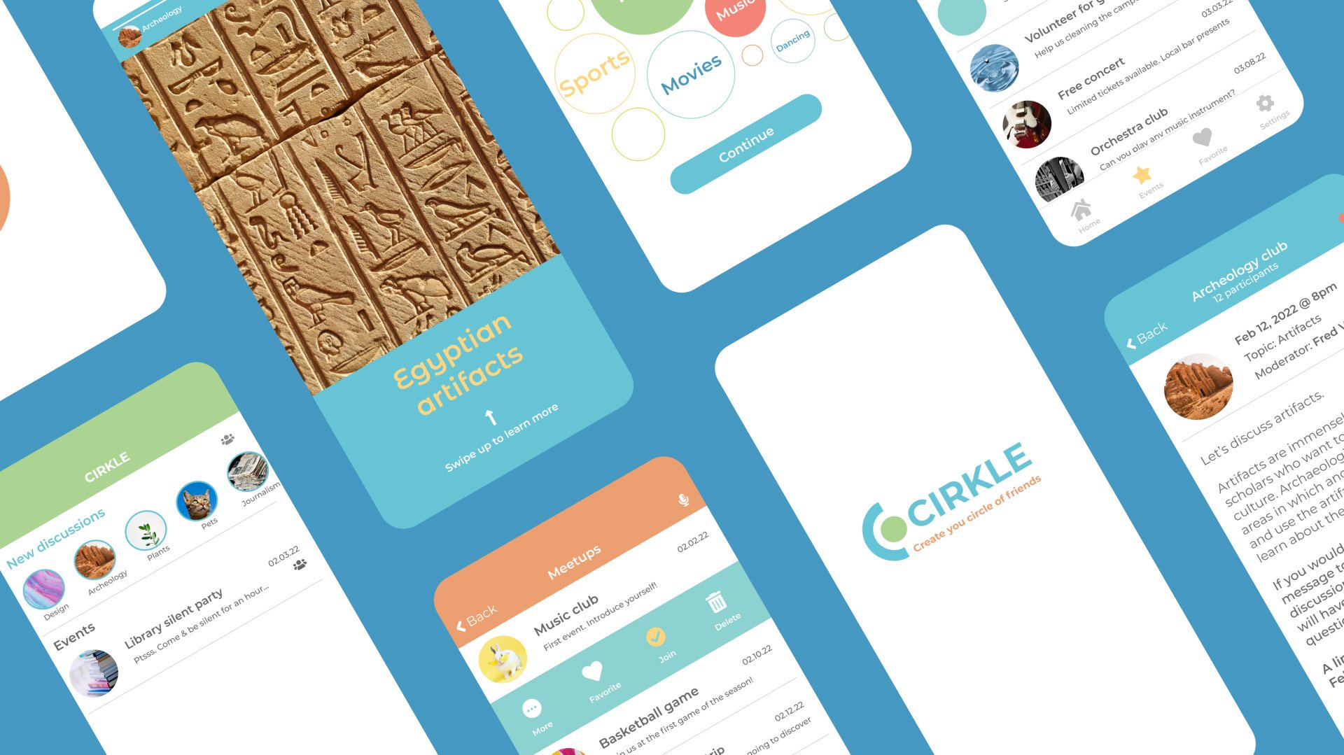


While registering at the app, students can choose interests that can be changed later in the settings. Interests contribute to suggesting events.

Depending on their mood, users can choose what they want to do. They have two options: talk and meet. They will get a list of events for meetups or online discussions.


If a user drags the event, a few options come out. The user can learn more about the event, add it to a favorite list, join an event, or delete it from a list.
On the homepage, users get a list of joined events and notifications of new meetups which can be easily changed to online discussions by clicking on the microphone and back when a user clicks on the icon of people.


When users click on the new event icon, they get stories of the event. They can go to the event page by swiping. On the event page, users can join a meetup or add discussion to their favorite list and join the event.
Test
User testing is key in the design process. Final user testing was positive and users were able to complete assigned tasks. A goal to combine two target users with different personalities but allow them to switch was achieved.
In the beginning, the moodboard was much brighter, but the colors were too disturbing for users, so a neutral color palette was chosen instead. The next step would be adding animations to the prototype and working on further development - adding taskflow for starting and creating groups as a user.
The next step would be creating wireframes and mockups to show all the stages of joining the discussion and talking. .